Looptroop
Over 2.7 million children in the United States have a parent in prison. The majority of these families live below the poverty line. Transportation to correctional facilities often located in remote, rural areas becomes not just a logistical challenge but an insurmountable barrier to maintaining family connections.
LoopTroop is a rideshare platform specifically designed to address this need. The product vision was sound. The execution was broken.
Category
Templates
Duration
1 week
Year
2025
LoopTroop
LoopTroop is a mobility platform designed for families who frequently book rides for dependents. When I joined the team, the core ride booking experience had measurable friction points and was contributing to booking errors, missed rider selection, and low clarity around scheduled rides. Despite being a safety-critical flow, the UX had not been revisited since launch.
App Design
AI
Educational platform
Digital Literacy
MY ROLE
Product
Designer
Double Agents Club is educational web app for teachers, parents, and children to critically evaluate information in the age of AI.
6 Weeks
DURATION
contribution
As the Product Designer leading the Family Ride Experience redesign, I:
Led end-to-end UX and UI redesign for the dependent riding and scheduling flows
Conducted user research including usability tests, competitive analysis, and task-based evaluation
Established LoopTroop’s first design system for scalable product development
Collaborated closely with the PM and engineering to address safety requirements & technical constraints
Created new interaction patterns (rider selection sheet, scheduling system, flow hierarchy)
Improved booking clarity and reduced rider-selection errors through iterative testing
THE problem (Based on user tests + flow evaluation)
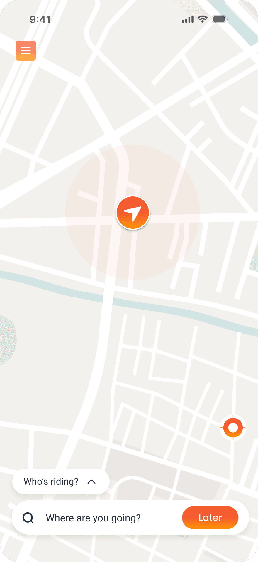
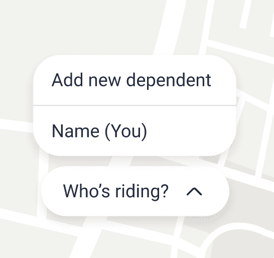
The existing “Who’s riding?” interaction created ambiguity and increased booking errors.
Low discoverability of safety-critical features
Poor visual hierarchy and inconsistent UI patterns
Outdated search and destination flow


The goal
Build a safer, clearer, and more predictable ride-booking experience.
To achieve this, our objectives were:
Reduce booking errors related to rider selection
Improve discoverability of scheduling
Increase clarity and predictability of the booking flow
Lay the foundation for a scalable design system
research
Understanding why users were making errors
Goal: surface mental models about when people choose riders and how they prefer to confirm identity for safety-critical bookings.
Methods
Competitive benchmark: Uber, Lyft, HopSkipDrive, Careem Kids (pattern capture)
Heuristic review of current LoopTroop flow (support log mapping)
Moderated interviews (n=6 parents / guardians) — think aloud + task walkthroughs
Business & PRD alignment


“Choosing riders before destination doesn’t make sense.”
Users expect rider selection after entering where they’re going.
Key Research Insights
“I need to clearly see who the ride is for.”
Visibility > minimal UI when safety is involved.
“Dropdowns hide important decisions.”
Bottom sheets improve clarity and reduce mis-selections.
“Let me add dependents later, not during onboarding.”
Creating dependents should not block first-time use.
solution
Reframing scheduled rides into a clear and intentional flow
Before

The redesign focused on fixing one core problem:
Users did not clearly understand when and how a ride was actually scheduled.
1. Entry point
Scheduling was hidden behind “Later,” making it feel like a delayed on-demand ride.


