MOBILE APP
Looptroop
COMPANY
LooopTroop
ROLE
Product Designer
duration
6 weeks
Team
4 Designers
3 Developers


00 — Contribution
As the Product Designer, I:
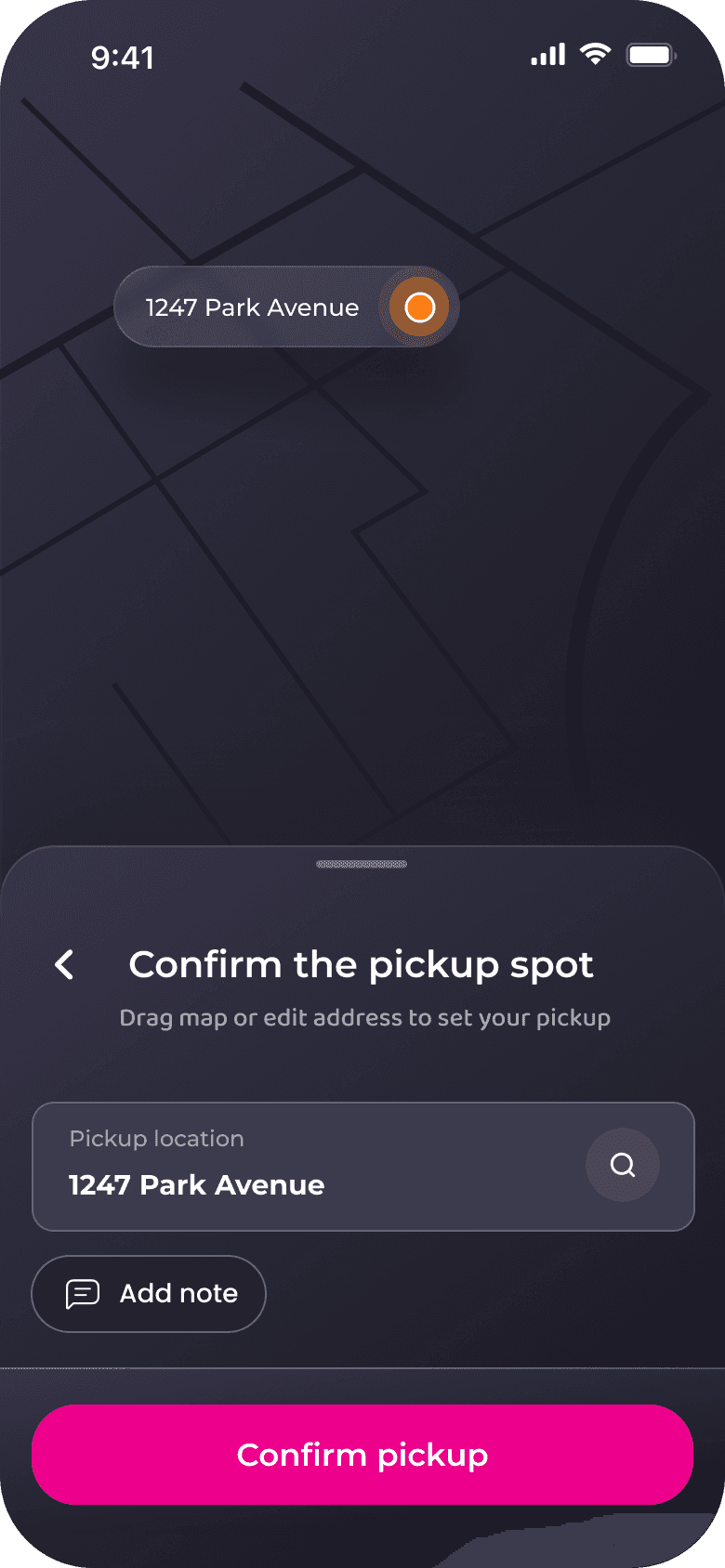
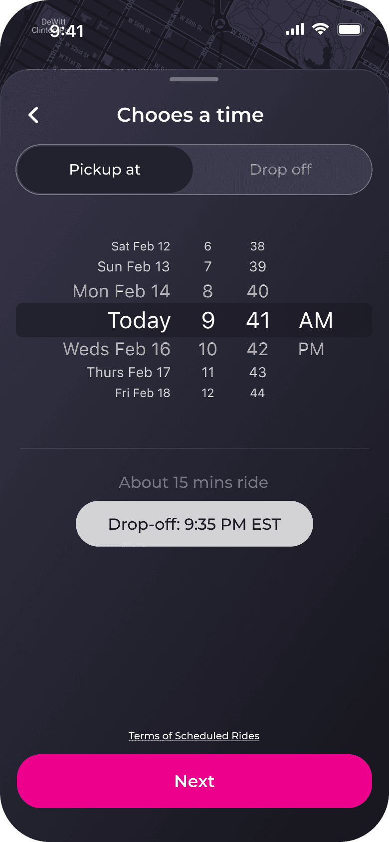
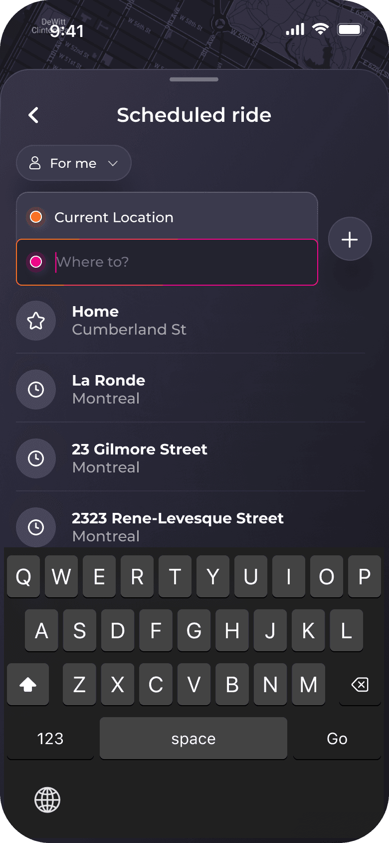
Led end-to-end UX and UI redesign for the dependent riding and scheduling flows
Conducted user research including usability tests, competitive analysis, and task-based evaluation
Established LoopTroop’s first design system for scalable product development
Collaborated closely with the PM and engineering to address safety requirements & technical constraints
Created new interaction patterns (rider selection sheet, scheduling system, flow hierarchy)
Improved booking clarity and reduced rider-selection errors through iterative testing
01 — Context
Why Did This Problem Exist?
LoopTroop is a rideshare app designed for families visiting incarcerated loved ones—a population that faces significant barriers accessing correctional facilities in remote areas.
Six weeks before public launch, we conducted usability testing with 12 target users. The results were catastrophic: only 2 participants (17%) successfully booked a ride without assistance.
02 — Problem
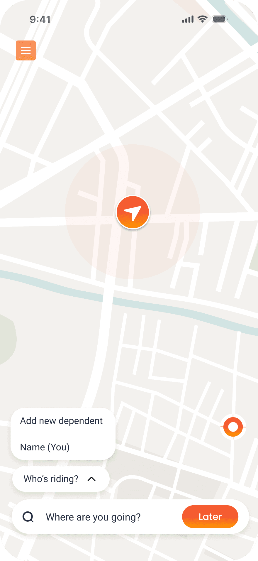
The home screen lacked a clear focal point, creating decision paralysis.
What Testing Revealed
Users hesitated 7.8 seconds before first tap. "Wait, who's riding? I haven't even told it where I'm going yet." Wrong question, wrong time.
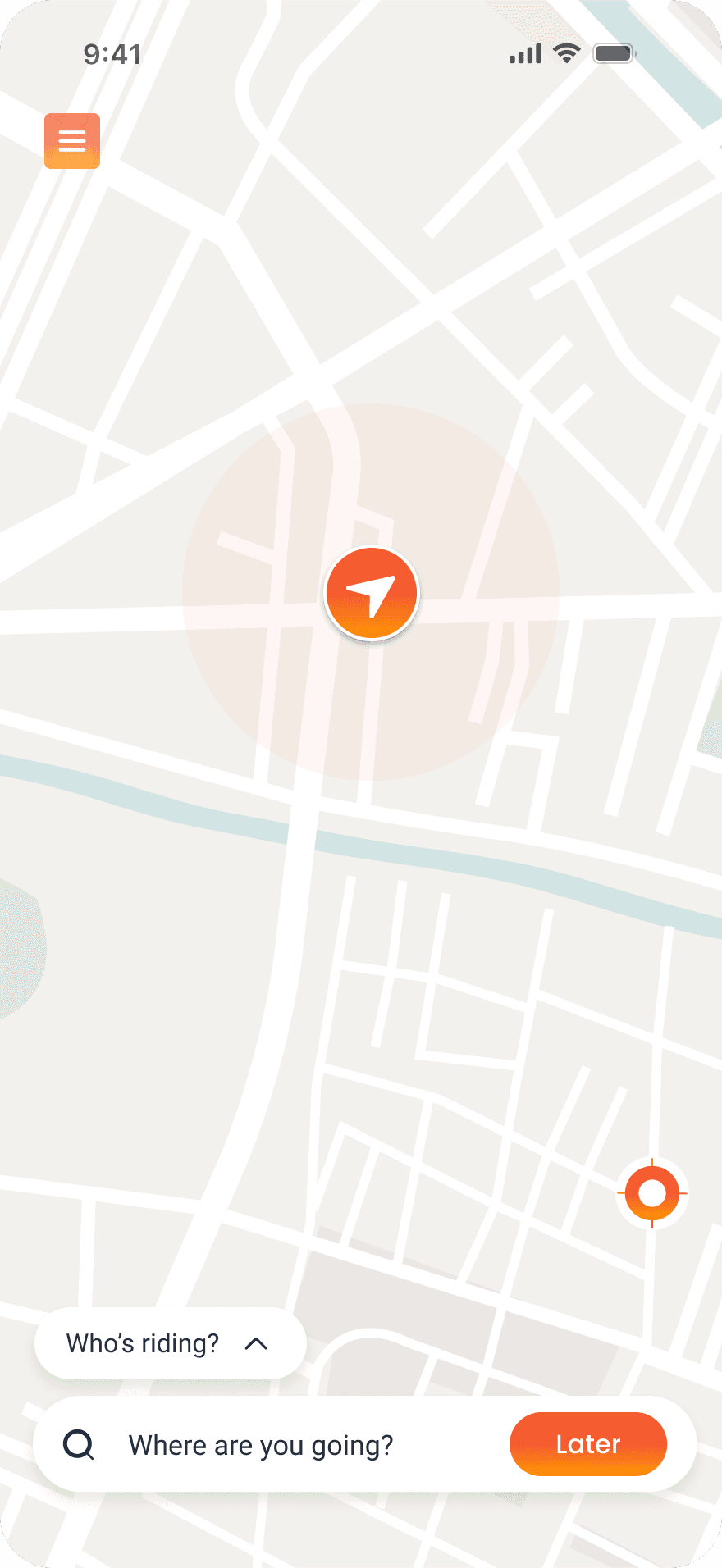
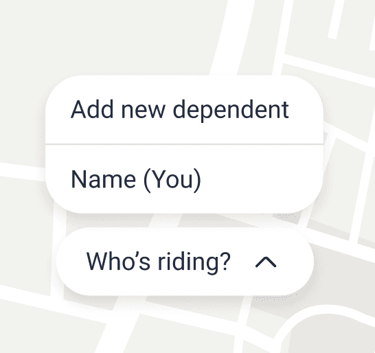


"Who's riding?" modal interrupts before user can orient
Low discoverability of safety-critical features
Poor visual hierarchy and inconsistent UI patterns
Outdated search and destination flow
03 — Research
What research revealed about user behavior
Research Methods
To understand why users were struggling, we conducted multiple research activities:
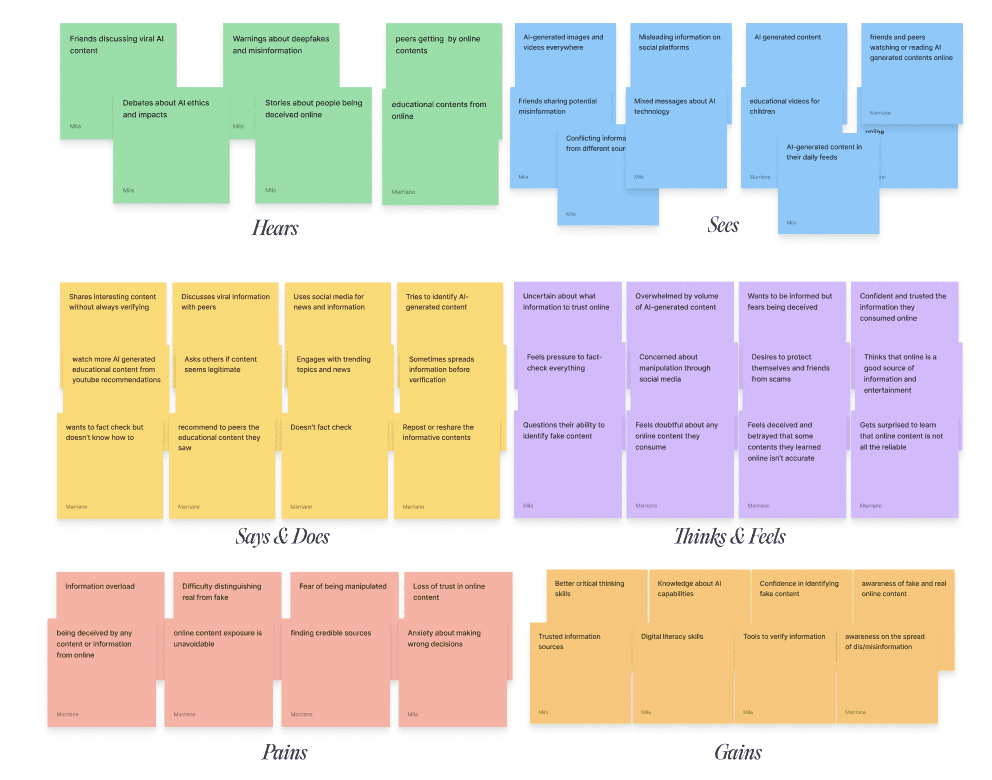


Think-aloud protocol — Asked participants to verbalize their thoughts as they attempted tasks. Revealed confusion points in real-time.
Follow-up interviews (n=6) — Deeper conversations with participants who struggled. Explored their context: work schedules, childcare, facility visiting hours.
Follow-up interviews (n=6) — Deeper conversations with participants who struggled. Explored their context: work schedules, childcare, facility visiting hours.
Screen recording analysis — Reviewed all session recordings, timed hesitation periods, noted where users looked and what they tried to click.
Competitive analysis — Tested Uber, Lyft, HopSkipDrive, Careem Kids etc, Via booking flows ourselves to identify patterns in successful rideshare apps.
Research Insight
Visitation = Planned, Not Spontaneous
100% of participants had already coordinated with facility visiting hours before opening the app
Question Order Matters
Users think in sequence: Where → When → Who"
"Asking 'Who's riding?' before 'Where?' confused users.
Map = Wrong Mental Model
Not one participant used the map to explore. All tried to type immediately.
The Central Insigh
Users don't want options at the entry point. A focal point isn't optional; it's the foundation of usable design.
04 — Solution
Why this solution was the most rational choice
BEFORE

AFTER
1
"Where to?" as Primary Focal Point
Research finding: 100% knew destination before opening. Asked "What's your first thought?" → All said "Tell it where I'm going"
Hypothesis: Leading with destination search matches mental model → faster first action
Validation: Time to first action: 8.3s → 1.8s (78% reduction). 14 of 14 clicked search immediately
2
Removed Map Interface
Research finding: Screen recordings showed 0 of 12 participants interacted with map. All looked for text input
Hypothesis: Map signals exploration, but users need confirmation (they already know facility locations)
Validation: Post-redesign: "This is clearer" (11 of 14). No one asked "where's the map?"
3
Surfaced Saved Locations on Home
Research finding: 16 of 18 visit same 2-3 facilities monthly. Follow-up interviews: "Why do I have to type this every time?"
Hypothesis: Recognition > recall (Nielsen heuristic #6). Saved locations reduce friction for 87% of trips
Validation: 83% of validation participants chose saved location when available. Task time: 8m 34s → 2m 41s
4
Unified Dark Mode Throughout
Research finding: 8 of 12 testing sessions happened 6pm-9pm (after work). Light mode: 5 participants squinted, complained of glare
Hypothesis: Dark mode reduces eye strain + improves legibility on older OLED screens (67% had iPhone 8 or older)
Validation: Trust score: 5.8 → 8.9 (+53%). Zero brightness complaints. Battery consumption reduced ~30% on OLED devices
05 — Key Learning
Improvement ≠ Perfection
"Validation showed 93% success, not 100%. Remaining 7% failed due to facility address typos, not UI issues. Knowing when to stop iterating saved 2 weeks.
Measure What Actually Matters
"Initially tracked completion time as 'simplicity' metric. Wrong. Time to first action (decision time) directly measured confusion. Changed what we optimized for, results improved."
Users Don't "Read" Interfaces
"Assumed users would scan the full interface before acting. Reality: they looked for one thing: destination input. Design for scanning behavior, not reading comprehension."
